
How to use and navigate Semble Data for your audits/reports.
In this article:
Managing The Size of My Export
Under the Data tab, you will discover three further tabs: Monitor, Analytics, and Reporting.

Monitor
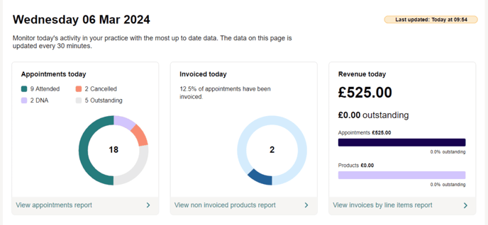
Note: The monitor tab shows today's data, updated every 30 minutes. You will see the last time the data was updated in the top right corner.
The three primary sections on this page are Appointments, Invoices, and Revenue:
-
Appointments - Shows your appointments today and their outcomes. Outstanding appointments includes all scheduled appointments that do not have a status selected in the calendar.
-
Invoices - Shows the proportion of appointments that have had an invoice created for them today. Note, cancelled appointments are not included in this graphic.
-
Revenue - Shows the overall revenue generated by the practice today, including breaking out what proportion is paid vs outstanding. Additionally, the breakdown is shown between appointments and products.
Note: Payments on Account are not included in the "Revenue" graphic.
Improve your Practice Performance
At the bottom of each of the three sections are buttons that will take you to a report to investigate further.

Note: Depending on your browser width, these buttons may appear slightly differently.
-
Click "View appointments report" to see details about all appointments.
-
Click "View non-invoiced products report" to see what has not been invoiced and needs to be.
-
Click "View invoices by line item" to see each item that is invoiced and whether it has been paid.
Analytics
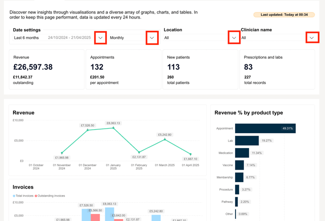
At the top of the page, you’ll find several filters to help you customise your view:
-
Date filter: Select the time period you want to review.
-
View format: Choose how to display the data — by week, month, or year.
-
Location filter: View data for a specific location.
-
Clinician filter: Narrow the data down to a specific clinician.
These filters make it easier to analyse the data based on what’s most relevant to you.
The Analytics tab is updated once a day to ensure optimal performance for all users.
You’ll see a timestamp in the top right corner, showing the date and time of the last data update.

Overview of KPI

This section gives you a clear overview of your Key Performance Indicators (KPIs), including:
-
💰 Revenue
-
📅 Appointments
-
🧍♂️ New patients
-
💊 Number of prescriptions
-
🧪 Number of lab orders
This KPI overview helps you:
-
📈 Track performance at a glance – Quickly see how your practice is doing over time.
-
🎯 Spot trends – Monitor increases or decreases in revenue, patient volume, and clinical activity.
-
✅ Make informed decisions – Use data to adjust staffing, appointment availability, or marketing efforts.
-
🕵️♀️ Identify areas of improvement – Easily pinpoint which areas may need attention (e.g., fewer new patients or lower prescription volumes).
-
📊 Measure the impact of changes – See the effect of new strategies, campaigns, or workflow changes on your core metrics.
By keeping an eye on these KPIs, you can make smarter, data-driven decisions to support the growth and efficiency of your practice.
Visualise Your Key Data

This section presents a series of visual breakdowns that help you better understand the key drivers behind your business performance.
Note: The visuals on the Analytics tab can dynamically interact, meaning you can click on one chart to filter another.
Each chart or table focuses on a specific metric to give you more context and highlight trends over time.
These insights include:

Reporting

The Reporting tab in Semble gives you access to a wide range of reports to help you track performance, monitor financial health, and gain insights into day-to-day activity within your practice. Simply click on the desired report to view the relevant data.
Note: Reports are updated every 30 minutes, allowing you to engage with data from the most recent hour.
The 'Last Updated' timestamp at the top right corner of your screen included in each report serves as a valuable indicator of how current the data is.
Any alterations made after this timestamp will not be reflected in the report.
Filter by Report Category

To help you quickly find the data you need, reports are organised into four main categories. Use filters to only see the reports within the chosen categorie!:
-
Income & Finance – Track revenue, outstanding balances, invoice summaries, and more to manage your practice’s financial health.
-
Appointments & Services – Get an overview of booking trends, cancellations, service performance and more.
-
Practice Productivity – Review practice activity and view patient details, contact information, letter records, and more to gain deeper insights.
-
Clinical Data – Access insights on prescriptions, labs, medical records, and other clinical information recorded during consultations.
Report Previews
Each report is displayed in a list format with a brief description of what the report includes. Simply click on the desired report to view the relevant data!

This makes it easier to:
-
Identify the most relevant report for your needs.
-
Quickly understand what kind of data each report provides.
-
Compare different reports to find the one that gives you the clearest insight.
Whether you're tracking performance KPIs, reviewing clinical activity, or reconciling financial records, the Reporting section brings clarity and structure to your data.
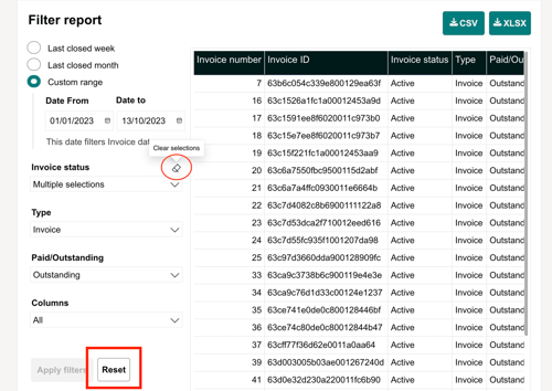
Select a Date Range
When generating a report, you can choose from three date filter options: Last Closed Week, Last Closed Month, or Custom Range.
Note: Selecting Custom Range gives you the flexibility to define a specific date range of your choice.
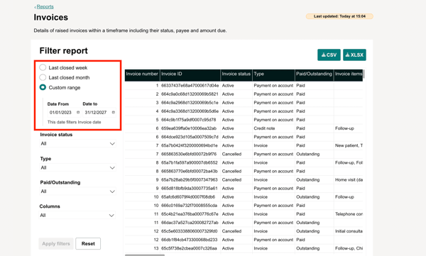
Expand The Report
On the top right-hand side, you’ll find an ‘expand’ icon that allows you to view the report in full width. This is especially useful for reports with many columns, as it makes the data easier to read and navigate.

Filter The Report
The filters on the right column of the report can greatly enhance your search efficiency by simplifying the process of finding the information you need.
You can customise the columns to display only the data you want by selecting your preferred options through the filters on the right:
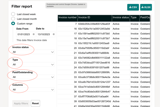
Note: Click the "Apply Filters" button at the bottom of the left panel to confirm your filter selections and refresh the results. Make sure to click it after making any changes.
Reset Filters
The "Reset" button at the bottom of your screen reverses any changes you've made, while the "Clear Selection" button clears your selected filter options.
Managing The Size of My Export
It's essential to note that our reporting system has a limitation regarding the number of rows that can be generated in a single report.
Currently, the maximum number of rows that can be included in an exported report is 30,000. This limitation is in place to ensure optimal performance and prevent potential issues related to excessive data processing and rendering.
Managing data with the limitation
Given the maximum row limit per report, it's important for users to be mindful of their data selection and filtering criteria when generating reports. Here are some tips on managing data within this limitation:
-
Refine Date Ranges: Narrow down the date range of your report to focus on specific time periods of interest. This can help reduce the volume of data and ensure that the report stays within the row limit.
-
Utilise Filters: Apply relevant filters to your report to narrow down the dataset based on specific criteria such as regions, categories, or product lines. Filters can help streamline the data and prevent unnecessary rows from being included in the report.
-
Break Down Reports: If your dataset exceeds the maximum row limit, consider breaking down your reports into smaller segments. Generate multiple reports with different date ranges or filtering criteria to capture the desired data without exceeding the row limit.
-
Export Raw Data: For detailed analysis beyond the row limit, consider exporting raw data directly from the platform's database or data export functionalities. This allows for deeper analysis using external tools or software capable of handling larger datasets.